Transaction Attribute Types
Items have attributes such as a title, an item number, or the date on which they were last modified. This section describes the task attribute types that are available by default in Allegra. Additional types can be added as plugins without changing the core software.
Person selection (general)
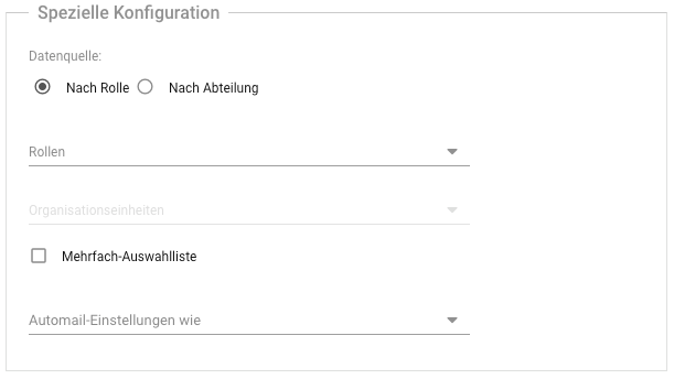
This attribute allows you to select a user. The persons that are available for selection can be based on roles or departments (organizations). It is also possible to set the notification scheme according to which they should be informed.
Person selection (on behalf of)
This attribute is treated like the author of an item. For example, a technician can create an item for someone else, who is then treated as if they had created the item themselves.
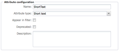
Short text
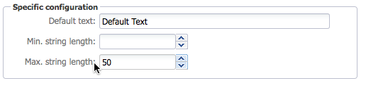
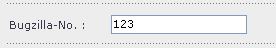
Short text properties can contain a short, unformatted text (one line, up to 50 characters).
You can define a default text to be displayed when you create an item, and you can define the minimum and maximum length of the property.
If you place this property on an input form, it will look like the one shown below.
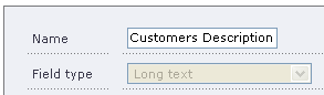
Long text
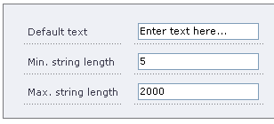
Long text properties can contain longer descriptions, up to thousands of characters. Long texts are displayed as a text workspace for convenient editing. However, the text cannot be formatted.
You can define a default text that is displayed when you create an item and you can define the minimum and maximum length of the property.
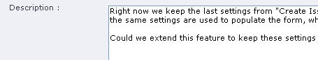
When you place this property on an input form, it looks like the one shown below.
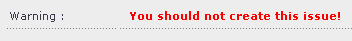
Rich Text Label
With the Rich Text Label attribute, you can display rich text, e.g., a warning.
If you place this property on an input form, it will look like the one shown below.
Date field
Date attributes contain date information. On the user interface, the date is formatted according to the user’s preferred format. Date attributes have a number of options.
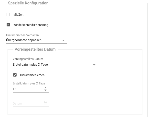
With time : Creates a date field with time specification
Recurring/Reminder : Allows regular dates to be entered
Set Date : Allows you to specify the initial value of the attribute
The field is empty
The field contains the current date
The field contains the current date plus X days or working days
The field contains a constant date
The field contains the date of the most recent creation of an item by the user
Hierarchical inheritance : The date is inherited from items higher in the hierarchy.
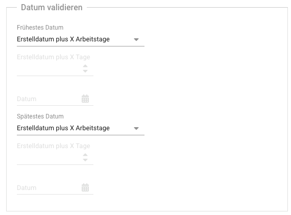
Validate Date : You can set limits on the date values that a user can enter.
The earliest date can be either now or a fixed date.
The latest date can be either now or a fixed date.
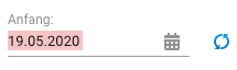
A date property appears on the user interface as shown below.
Integer
Integer properties can contain integer numbers, either negative or positive.
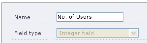
You can define a default, minimum, and maximum value. The minimum value must be less than the maximum value, if one exists. Furthermore, the default value must be greater than or equal to the minimum and less than or equal to the maximum value.
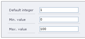
On the user interface, this property appears as shown below.
Floating point numbers
These attributes can hold positive and negative floating point numbers.
You can define a default, minimum, and maximum value. The minimum value must be less than the maximum value, if any. Furthermore, the default value must be greater than or equal to the minimum and less than or equal to the maximum value.
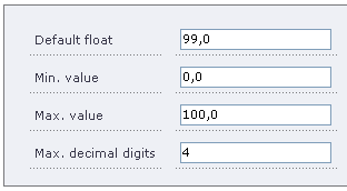
On the user interface, this property appears as shown below.
Checkbox
Checkbox attributes can be checked or unchecked.
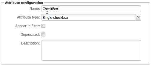
You can define a default value, either checked or unchecked.
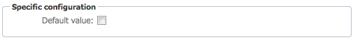
On the user interface, this property appears as shown below.

Simple checklists
Simple checklists allow you to select one or more options from a list.
Attention
You must have already defined a simple list before you start to define this type of attribute. Otherwise, you cannot complete the definition of this type of property.

If you place this property on a form, it will look like shown below.
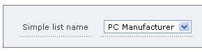
Expandable dropdown list
The expandable simple select lists allow the selection of a single item from a list. The list can be expanded from the input mask.
Attention
You must have already defined a simple list before you start defining this type of item property. Otherwise, you cannot complete the definition of this type of property.
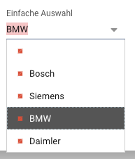
If you place this property on a form, it will look like shown below.
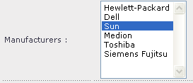
Multiple selection list
Multi-select lists allow you to select one or more options from a list. The default value is configured as part of the list, not as part of the attribute.
Attention
You must have already defined a simple list before you start defining this type of item property. Otherwise, you cannot complete the definition of the attribute.
If you place this property on a form, it will look like shown below.
Cascaded selection list (Parent-Child)
Cascaded selection lists of parent-child type allow you to choose from a list of parent options. When a parent option is selected, the list of selectable child options changes. For example, the parent list could be a set of products, and the child list could be the components that belong to it.
Attention
You must have already defined a simple list before you start defining this type of item property. Otherwise, you cannot complete the definition of the attribute.
In our example, we have a short list of customers, Bosch and Siemens. The children are divisions of Bosch and Siemens. For Bosch, we have the petrol and diesel divisions, while for Siemens, we have the telecommunications and medical divisions. All this information is contained in the list named “Customers”.
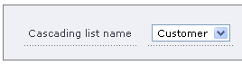
When placed on an input screen, this selection looks like the one shown below.
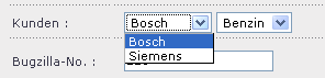
When the selection in the left field is changed, the selection in the right field also changes. Another example would be a selection for an operating system: Windows, Linux, Solaris on the left side and the version (98, ME, XP, Vista, Redhat, Debian, SuSE) on the right side.
Note
Even though the selection appears as two properties, this will be a single property in the database. To search for this in TQLPlus, you need to look for “Customer: Bosch # Gasoline”. The property name will appear as part of the tooltip if your label is different from the property name.
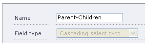
Cascaded selection list (Parent-Children)
Cascaded selection lists of parent-children type link two lists of child options to a single entry in the parent item list. The first child has no dependency on the second child.
For example, if the parent item list contained vehicle models, the first child list could contain engine sizes available for that model, and the second child list could contain colors for that model. Different models can be offered with different engine sizes and colors.
Attention
You must already have defined this type of list before you start defining an item property of this type. Otherwise, you will not be able to complete the definition of the attribute.
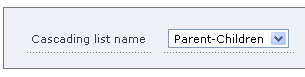
In our example, we have defined a generic list Parent-Children with three parents, Parent-1, Parent-2, and Parent-3. Each parent item has two lists with a number of child items associated with it. For example, Parent-1 has in its first child list Child-1: 1, Child-1: 2 and in its second child list Child-1: L1, Child-1: L2, Child-1: L3. The names can, of course, be anything you want.
On the user interface, it looks like illustrated below. When the parent selection is changed, the two child lists change as well.

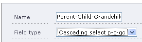
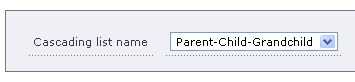
Cascaded selection list (Parent-Child-Grandchild)
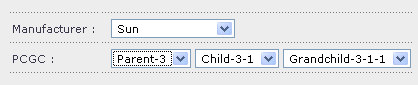
Cascaded selection list of parent-child-grandchild type creates a hierarchy of dependencies. The children list is unique for each parent. The grandchild list is unique for each child. This can be thought of as a tree with a depth of two levels.
For example, if the parent item list had car manufacturers, the child list could contain models for each car manufacturer, and the grandchild list could contain engine sizes for each model of that manufacturer.
The engine size that could be selected depends on the specific model of that manufacturer.
Attention
You must already have defined this type of list before you start defining an item property of this type. Otherwise, you will not be able to complete the definition of the attribute.
In our example, we have defined a parent list with three parent entries. For each parent, we have defined three children. For each child, we have defined a number of grandchildren.
In the user interface, this property type would look like the one shown below. If you change the parent selection, both the child and grandchild selections change automatically.
If you change the child selection, the grandchild selection changes automatically.
Workspace selection
The workspace selection allows you to link another workspace to an item.
Item selection
The item selection allows you to link another item to the current item.
Radio group
The radio group provides a selection from a list to highlight an item. The radio buttons can be arranged in a row or array.
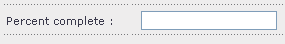
Integer divisions
This attribute allows you to form the quotient of the values of two lists. You can specify which list is to serve as the dividend and which as the divisor.
This attribute is useful, for example, when calculating a backlog priority in the form: “Backlog Priority = Business Values / Story Points”.