Taskboard
With the taskboard or agile board, you present your items as cards, which you can assign to other employees and change their state by moving them.
You can select which task attribute to use as the column identifier. Also, you can exclude values from being displayed so that you only see the columns that interest you.
You can select the sorting criteria within each colum and arrange columns by dragging them to a specific location. Moreover, you can configure which properties are displayed on the cards and how they are laid out.
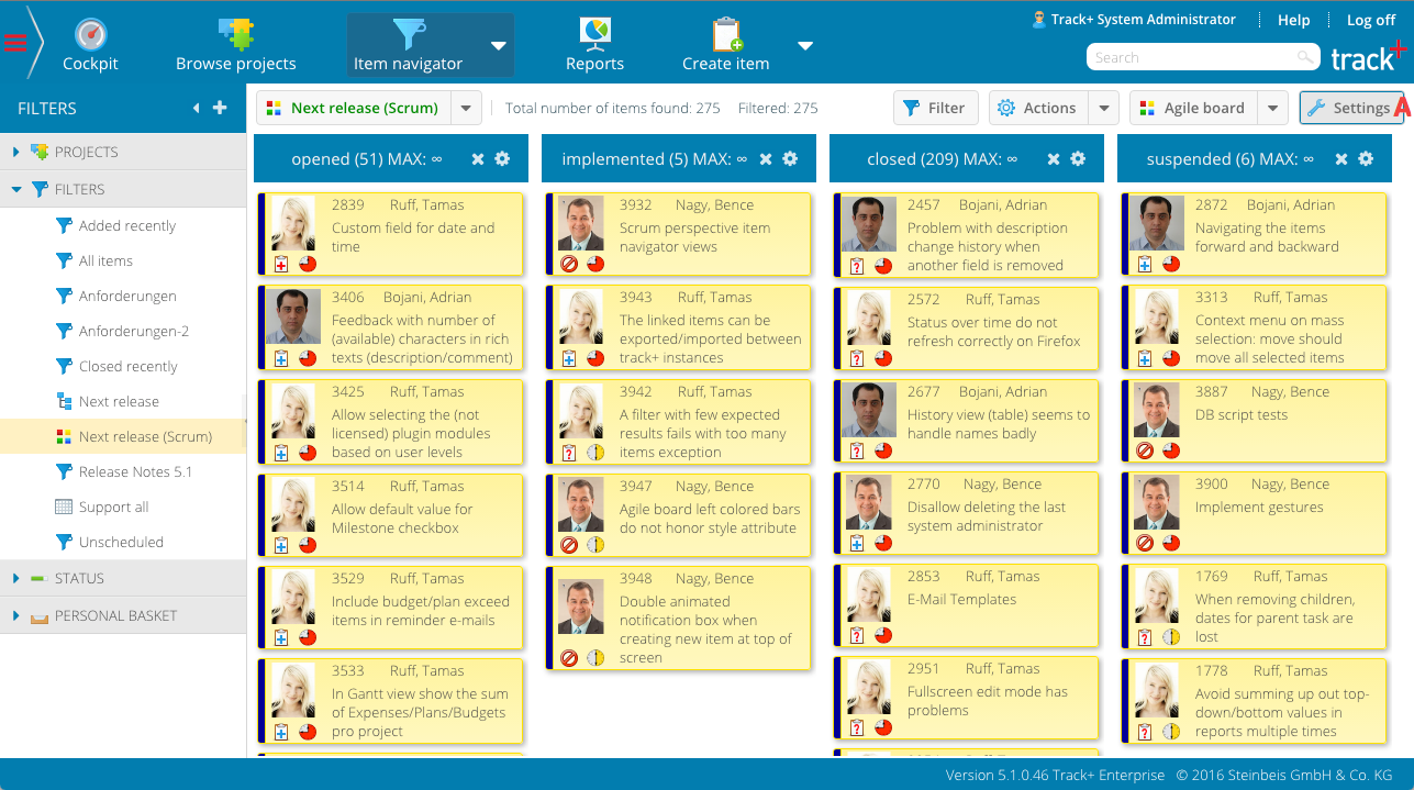
Cards on the agile board are organized into rows and columns. You can choose which item property is taken to place an item in a column. You can only select items that are based on selection lists, such as state, owner, manager, or priority.
Click the “Settings” button (A) to display the agile map configuration workspace.
Select the desired column property.
Click the “Settings” button (A) again to hide the configuration workspace.
Within each column, you can define the sort order for the cards based on the task attributes. define.
Click the Settings button (A) to display the agile card configuration pane.
Select the desired column sort order.
Click the “Settings” button (A) again to hide the configuration workspace.
In some cases, you may be able to view the entire set of values possible for the column property. You may want to display only some states or some responsible parties, but not all of them.
Note
Even if you have not selected a value to be displayed, the system will display whether there is at least one item with this value.
Click the Settings button (A) to display the Agile Map Configuration pane.
Select the desired column property values. The order in which you select values determines the order in which the columns are displayed.
Click the “Settings” button again (A) to hide the configuration workspace.
You can remove column values from the agile map to limit the number of columns shown. To remove a column, click the small “remove” icon on the right side of the column header.
Note
You can remove a column by clicking the “remove” icon on the right side of the column header. However, you cannot remove columns if there is at least one item with a corresponding property value.
The agile board allows you to perform a number of actions using the drag and drop method.
To change the order of columns, click the header and drag the column to the new position.
To change the item’s column property value, click on the item and drag it to the column with the appropriate value. For example, if the column property is the item state, change the state of an item by dragging it to the column that represents the new state.
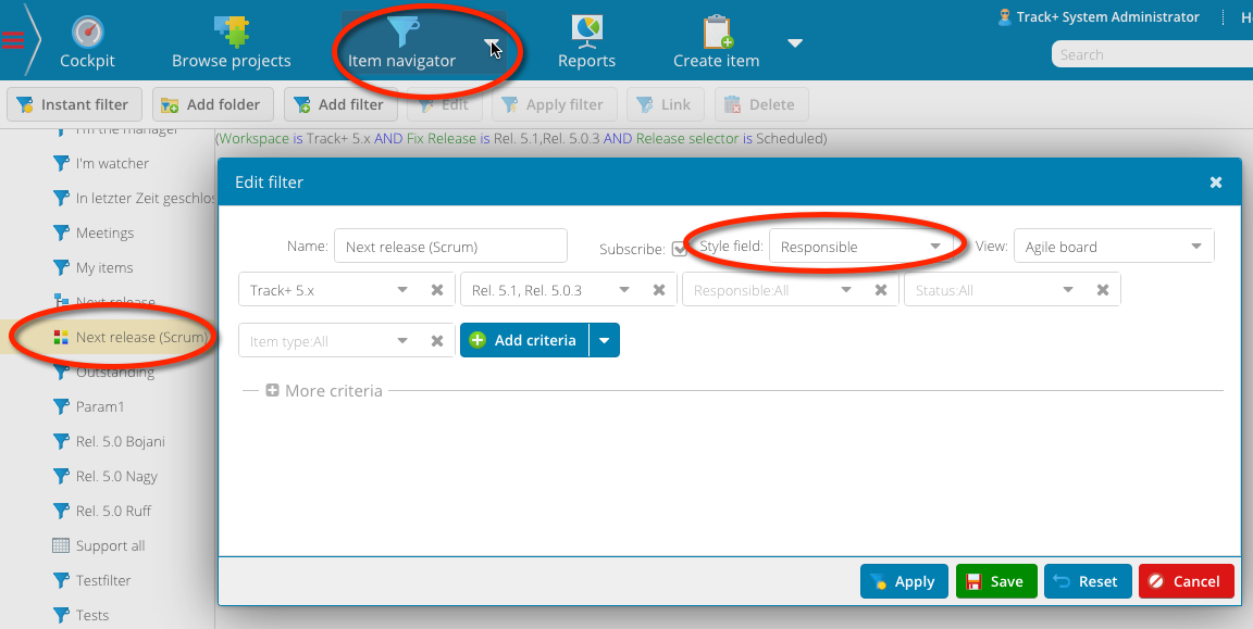
The color of the bar on the left side of each card is determined by the “style” attribute of the current query (Item Navigator > Manage Filters). When you define a view, you can use any appropriate item attribute, such as status, item type, responsible, etc., to determine the color.
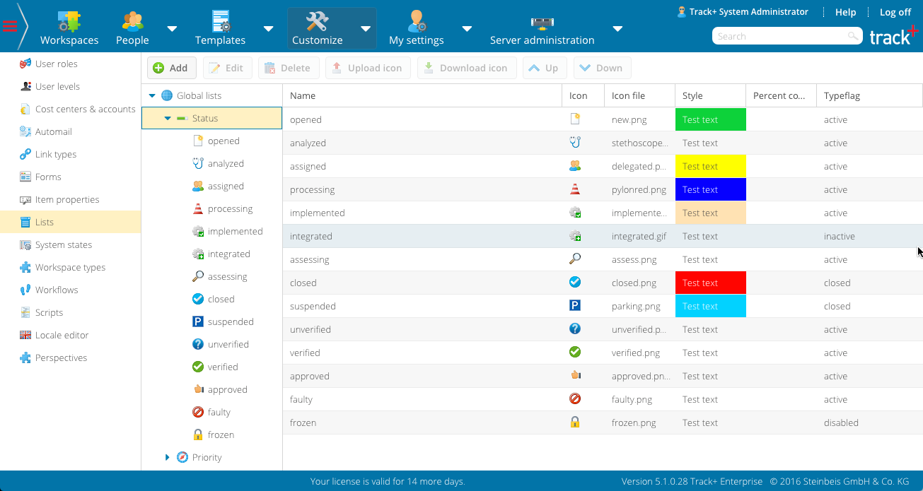
The colors for each property value that you define in the list of configuration settings exist in your system. For responsible persons, the style settings are defined in each user profile. To define the list entry colors, you must have system manager privileges (switch to the Administration perspective, Customize > Lists > Global Lists).
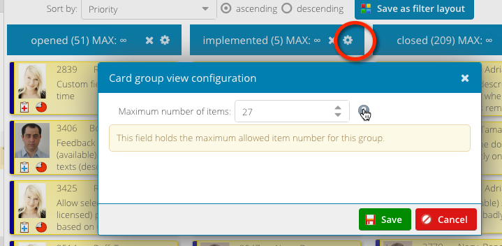
You can set a limit on how many items can be placed in a column in the workspace. The limit applies to new items only. To set the limit for a column, click the configuration icon of the column heading and enter the limit.
You can define what is displayed on the task cards and how it is displayed. To change the configuration, right-click on the cards and select “Configure card content” from the context menu.
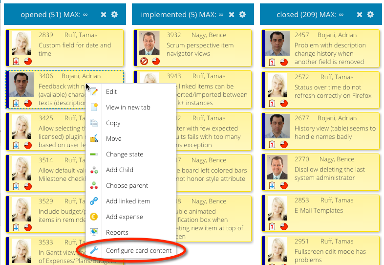
A screen appears very similar to the item form configuration screen. The map configuration follows the same pattern as that for the cockpit configuration and the item form configuration, except there are no tabs and only one panel. Here is how we created the layout shown in the figures above:
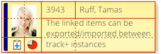
First, we selected the panel and there were three rows and four columns. Then we proceeded as follows:
From the attribute panel A, we dragged the “responsible” property to the top leftmost field of the panel.
We selected the field and in the field attributes we set column to 2, row span to 2, hide indicator, label horizontal alignment to the left, and icon rendering to icon (this shows the avatar in the case of user fields instead of the name).
We dragged the item number attribute to field row 1, column 3 and set the label horizontal alignment to the left.
We dragged the responsible attribute to row 1, column 4 and set the label horizontal alignment to the left.
We dragged the item type attribute to row 3, column 1, set the icon rendering to icon, and marked the horizontal alignment to the left.
We dragged the priority attribute to row 3, column 2, set the icon rendering to icon, and marked the horizontal alignment to the left.
Finally, we dragged the title (synopsis) attribute to row 2, column 3, set the row span and column span to 2, and set the value horizontally to the left and the value vertically to the top.