State Over Time
With this powerful graphical cockpit tile you can visualize the development of your project over time. The change in the number of items per state can be a good indication of how close you are to project completion and can give you information about the workload you need to manage.
Configuration
This tile must be configured before it can be used.
Follow the general procedure to configure the cockpit and the tile:ref:cockpit.
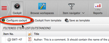
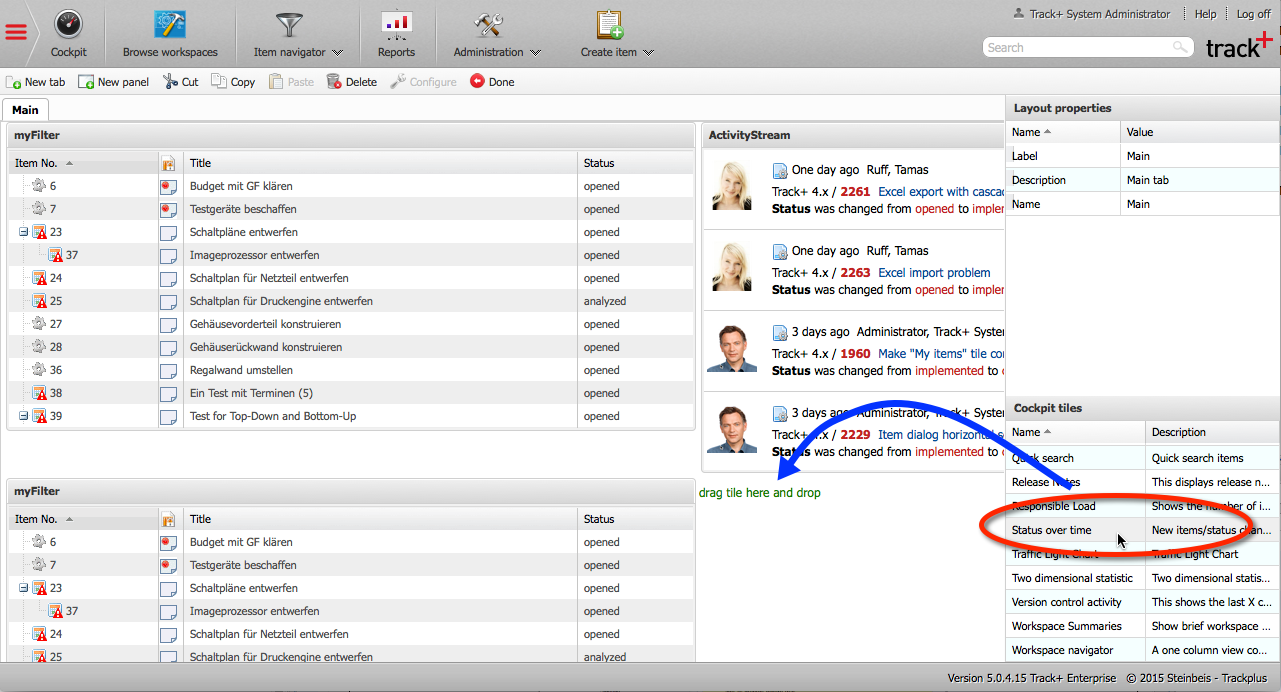
From the list of cockpit tiles at the bottom right, select “State over time” and drag it to the desired location in the cockpit.
Right click on the tile and configure it.
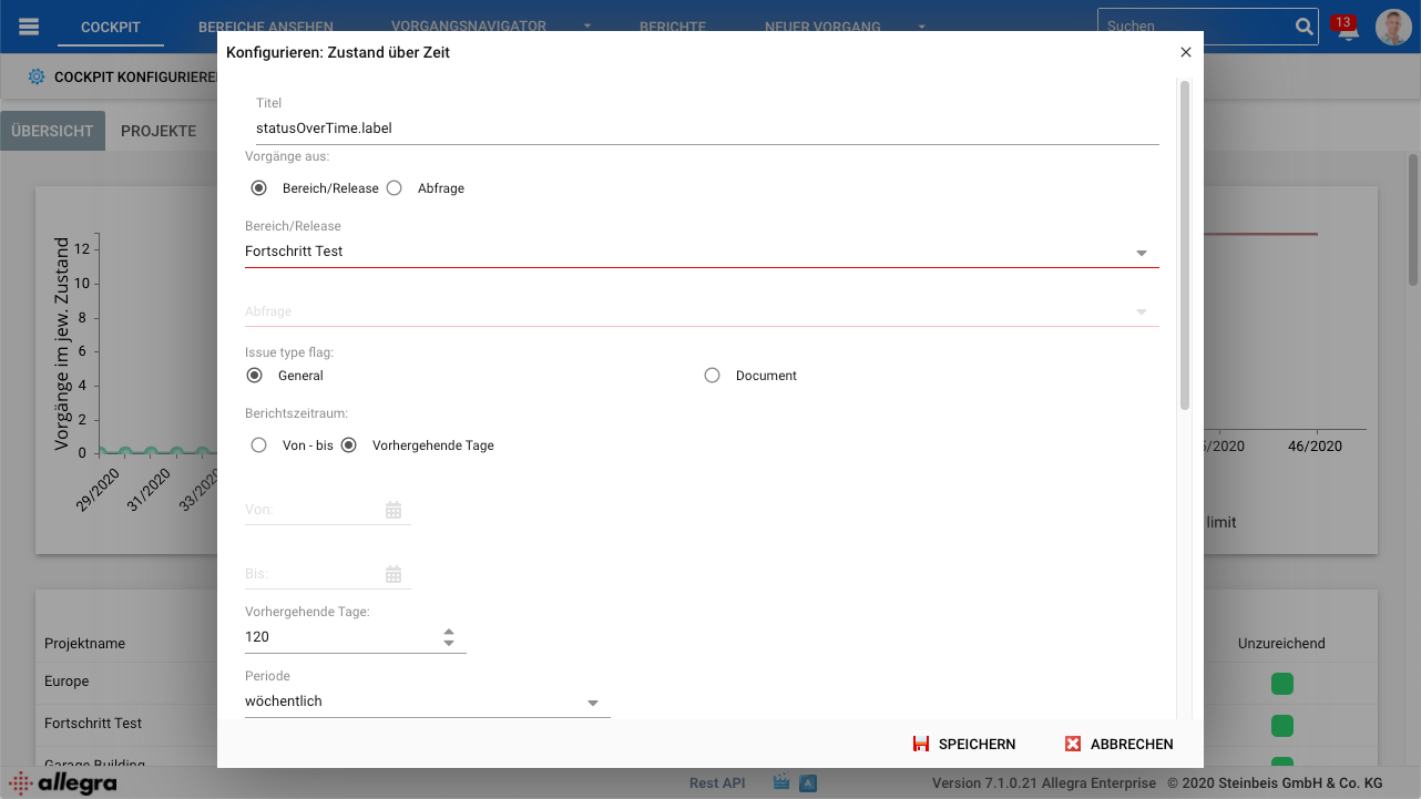
You have a number of display options. First of all, you should give your tile a meaningful name, so that you know later what you are actually seeing there.
Then you need to specify the projects or releases you want to monitor. You can select an entire project, which can include all associated project releases or just a few releases.
Next, select the reporting period you want to monitor. You can either specify a fixed interval that starts and ends on a specific date or simply look at the last X days.
Next, you need to set the granularity of your tile, for example, it can be daily, weekly, or monthly. The granularity determines the time interval that will be used to calculate the associated values. If the granularity is “Weekly”, a report interval goes from the beginning of a week to the end.
In the next step, you need to select the type of algorithm you want to use for calculating the values to be displayed. There are four different algorithms available:
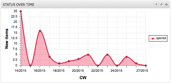
New items in interval: This chart shows the number of new items created per reporting interval (day, week, month).
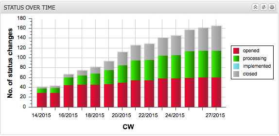
Accumulated Activity: This chart shows the accumulated number of items that have changed to the selected state in each selected interval. For example, if the granularity was set to “Monthly” and the state was set to “Implemented”, the chart would show for each month how many items changed to the “Implemented” state in that month and in all months prior to that until the start of the reporting period.
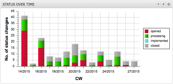
Interval Activity: This chart shows the number of items that changed to the selected state within the selected interval. For instance, if the reporting interval was set to “Monthly” and the state was set to “Implemented”, the chart would show how many items changed to the “Implemented” state for each month.
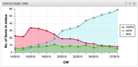
Number of items in interval: This chart shows the number of items that are in the selected state at the end of each reporting interval (day, week, month). For example, if the reporting interval was selected as “Weekly” and the state was selected as “Closed”, the chart would show for each end of a week how many items were in the “Closed” state at that time.
In the last step, you can still set the item states to be considered. In the case of “New items in interval”, the state is meaningless because only the creation date is taken into account.
You can group states into categories and display only the categories. You can either use a stacked bar chart or a line chart. Optionally, you can fill the workspace below the lines.
The following figures show some example of “State over time” views.